The eSports world continues to grow. It is anticipated to reach 1.5 billion dollars in 2020. Brands like Uber, Red Bull, and Ford are spending a lot of money to sponsor eSports events, tournaments, and teams. To put it into perspective: eSports fans spend three times more money than the average basketball fan to participate in the action. Essentially, esports teams are just brands. They represent a tribe or a symbol for people to come together in one place. That is why the design of an esports logo is so important. It connects the fans to the team’s players.
Other than that, through esports logo maker, fans try to copy their favorite team’s logo and use it on their t-shirts, tattoo, bags, etc. So, ideally, the design should be kept simple.
A good esport logo should be bold, readable from far away, have a solid concept, and color scheme. It should quickly convey what the team stands for. A lot of people say a decent logo will also stay relevant with time. However, since the esports industry is relatively new, we have not considered this concept while curating this list. Here are the top five esports logo ever, according to us.
On Number Five We Have Natus Vincere or NaVi
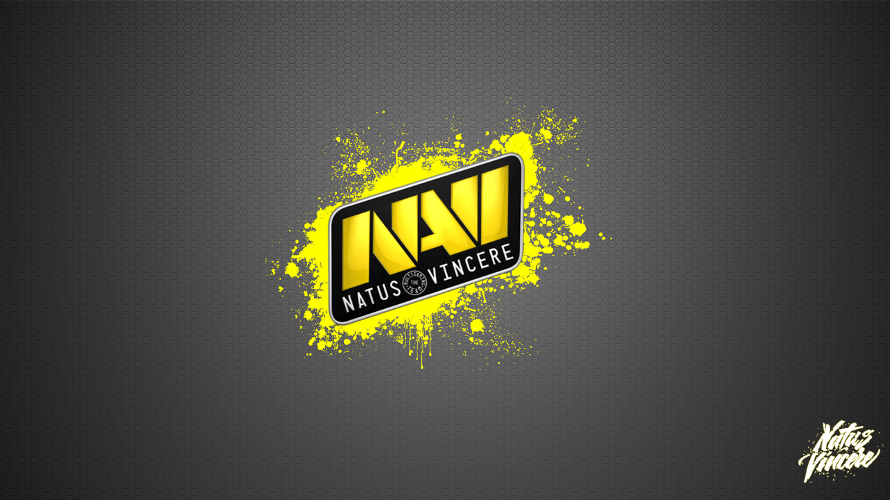
Natus Vincere is a Latin phrase that translates to “born to win” in English. This esports team logo is versatile and straightforward. It can be instantly recognized by all their fans across the globe. We like this logo so much because it looks impressive on everything- whether it be a gaming chair, a clothing article, or a sticker. However, it is ranked on number five of this list because it is kind of small. Moreover, this esport logo does not make sense why they put the phrase “The Multigaming Team” there. I mean, it is a pretty obvious bit of information, so it feels unnecessary.
Number Four eSports Logo: Fnatic
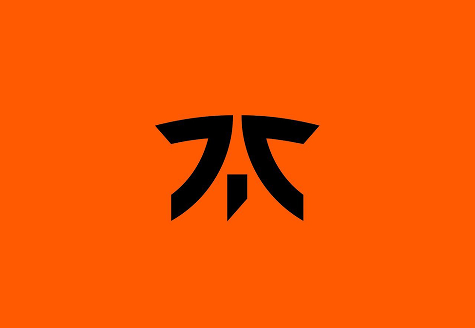
This team’s logo is a monogram. For any person who does not know what it means; it is basically a symbol or a motif that has two (or more) letters. This esports team logo is one of the best examples of a monogram logo. The “F,” “I,” and “C” are visible and readable. However, where is the “N,” “A,” and “T”? Some fans may argue that these letters were not supposed to be a part of this esports logo. Nevertheless, whether every letter is visible or not, we are sure about one thing. It is truly an unforgettable logo. However, this one is easy for fans trying to be creative with esports logo maker.
Number Three: Echo Fox
Number three in the list of top esports logo is Echo Fox’s.
Echo Fox’s official logo has some strong movement to it. It is fitting, simple, and we can not help but love the little fox character! I guess writing this much about their logo is enough because you are probably too focused looking at the cute little fox anyways.
Number Two: Cloud 9
We love how creative this esports team logo is; 9’s making up a cloud. It is memorable and simple. In fact, even the backstory of this logo is very interesting. The team owner hired a professional logo designer to make their logo. However, a completely random guy pitched a different idea and said to the owner that’s how he envisions the team’s logo. It gave birth to the Cloud 9 logo we know today. However, we are kind of curious about the professional designer’s logo concept.
Number One: G2 Esports
From the simplicity to the creativity, there is not a single thing we can point out that is distasteful in this esport logo. The facemask made with the letters perfectly fits the samurai. The overall effect of the logo is simple despite minor details such as the scar slashed across the “2.”
Best Esport Logo: Final Thoughts
The best part about all these logos is that amateur designers made them. They are not a result of some formal process. It just goes to show that sometimes amateurs can do a better job than professionals.


